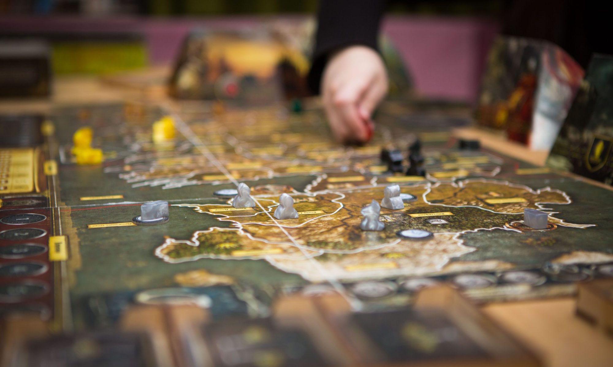
For our current project we have come across an interesting puzzle to solve. Modernization.
One of the reasons this is such a challenge is because of the history in the game. Players have been continuing to learn and challenge themselves for over 20 years with different strategies. So with modernization, there is a need to respect that history, but also a need to incorporate the things game designers have learned about the way these games are played over that time as well.
Here’s a good example:
Attack/Power/Strength – This is typically a numerical value that indicates the damage that a card can inflict on other cards, or against the life points of the player. Most games are spent by setting up cards to attack, others to defend, with the overflow going against the life points of the player.
In the early days of collectible card games, this was typically represented by a keyword, or sometimes multiple thematic keywords that were treated synonymously for gameplay purposes. The key word would always be in a consistent place in every cards. In modern game design, this has been replaced by an icon (such as two swords crossing) or simply by a large colored number (red for attack, blue for defense).
As a designer, there is a need to balance the simplicity that comes with modernization, against the thematics and specificity of the original design. In the early days, cards contained lots of text to explain how to use them. We’ve seen a lot of designers struggle with this balance when coming up with their cards.
Here is an example we saw at GenCon:
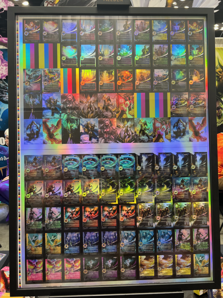
In this case, the designers have some beautiful art. To avoid distracting from that, they have chosen to use text – similar to the early designs we have seen in historical games. Unfortunately to fit this text in the space allotted, the pt size of the font is so small it becomes almost unreadable. Our recommendation for this would be to select some common phrases and put a library of iconography that can help relieve some of the stress this puts on your eyes. They also used keywords where a simplified icon could easily have worked better.
Can you imagine trying to play a game where you need to squint and read every single card as you move forward?